The Axis of Innovation
Nexus Health
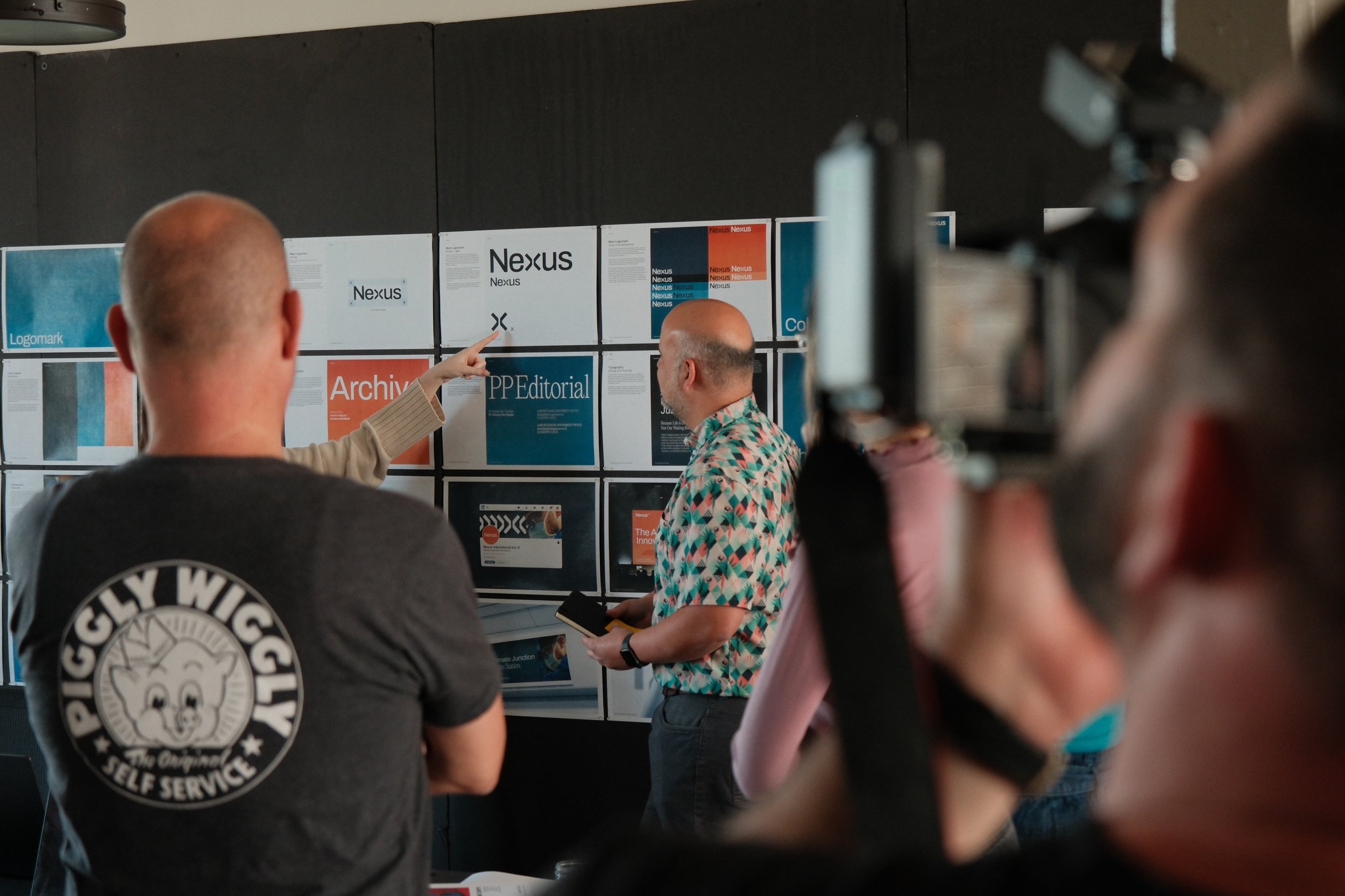
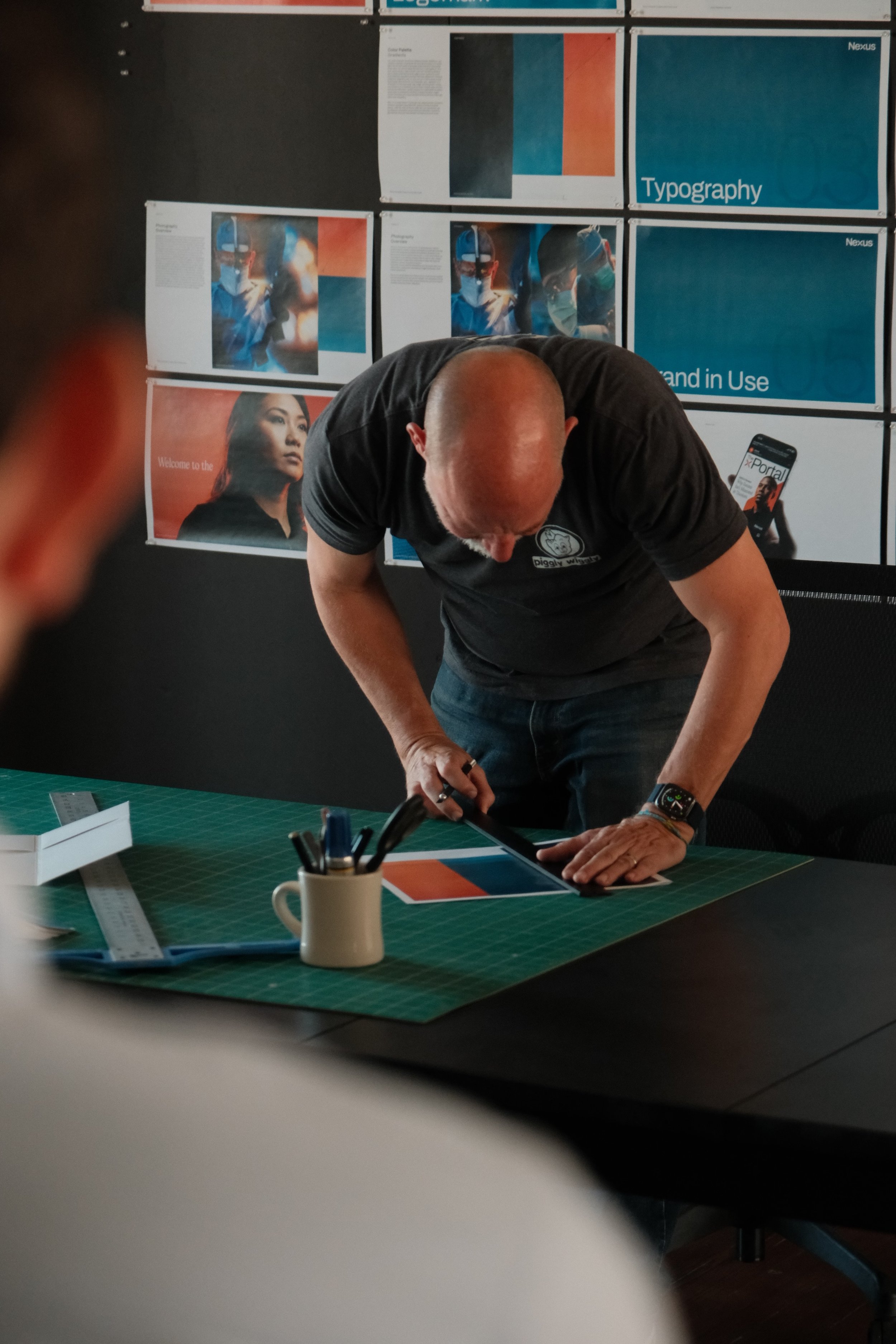
Branding
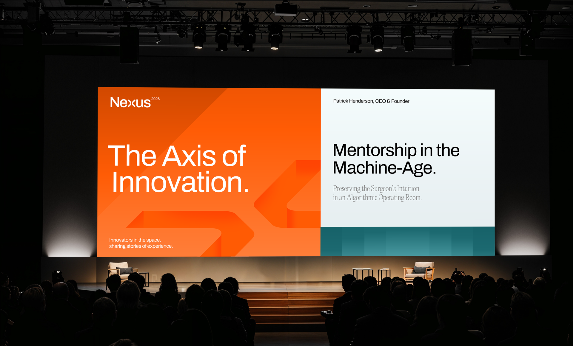
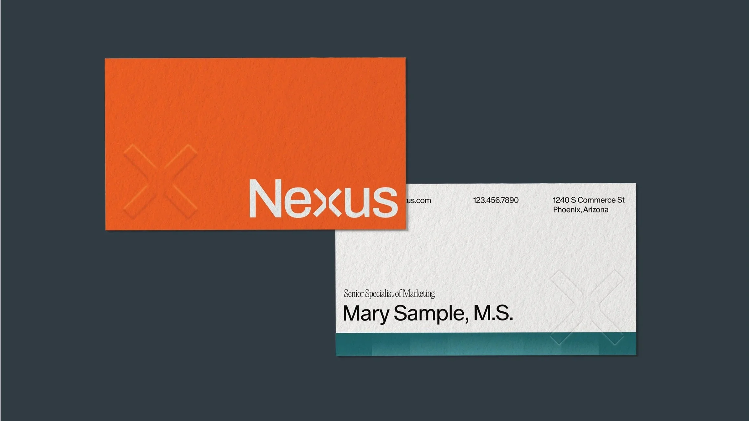
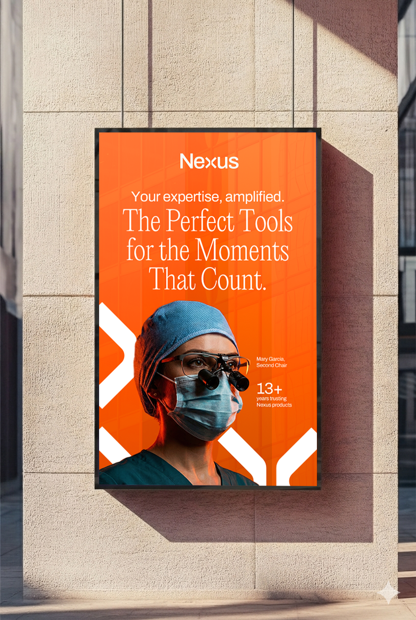
Print Examples
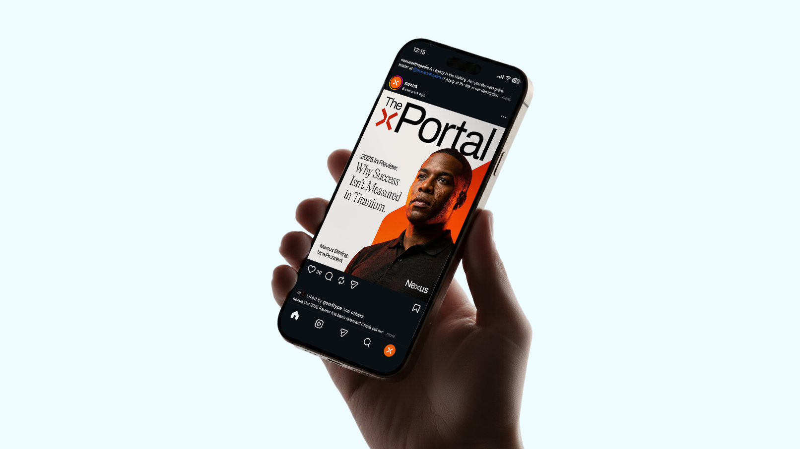
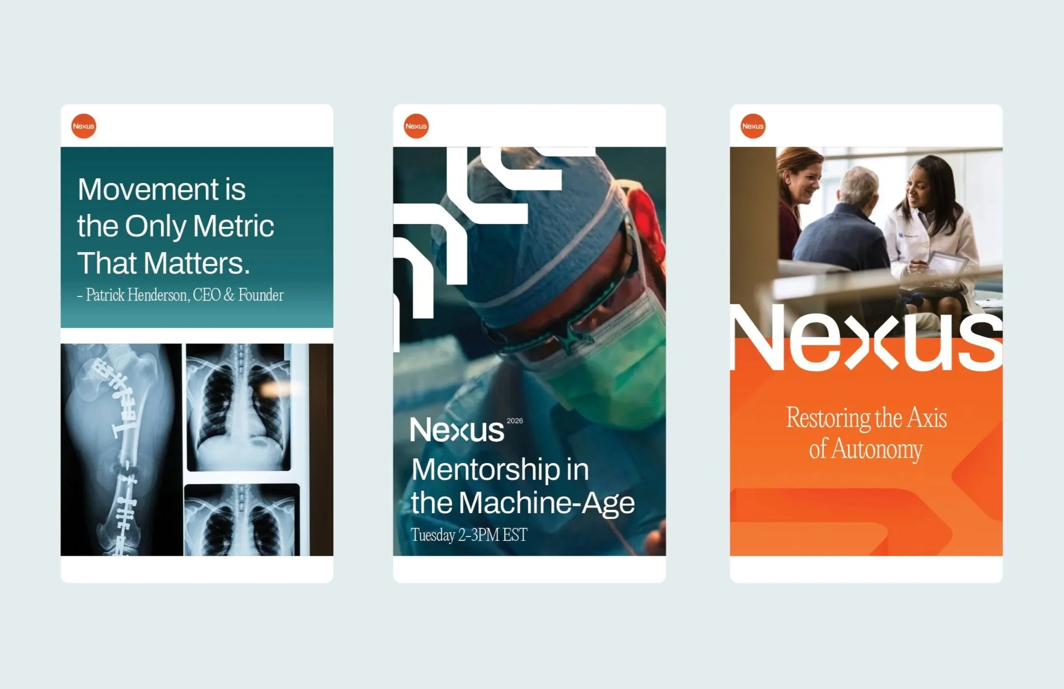
Social Media
Photography
Layout
Icon Design
Nexus Health is a healthcare solution firm built at the intersection of structural integrity and human connection. We see an intricate blueprint of ambition to help keep our customers on their own two feet.
Our goal was to build a visual and verbal identity that feels “etched” rather than printed–a brand that carries the weight and strength they give to their patients. Moving away from traditional treatments in the medical space and honing in on what Nexus stands for made it a challenging yet rewarding rebrand.
More executions available upon request.

The Bridge Between Medical Advancements and Human Autonomy
The Nexus logomark is a snapshot of what Nexus stands for. Connection.
Both halves of this mark encompass the bridge between medical advancements, trials, and implementation with real results directly to lasting human results.
This is also a nod to our heritage and time in the surgical space. With years of experience, we wanted to show notable suture styles that surgeons use once they wrap up their procedure. This small moment makes lasting impressions on both patient and surgeon as we strive to make the best products for our customers.